Conditional formatting
Observe offers a number of useful ways to quickly sort, filter, and visualize your data. When working with tabular data in a Worksheet or Log Explorer, you can use conditional formatting to apply color and style to string and numeric columns. This allows you to quickly visualize patterns in a data set.
Where you can use conditional formatting
Conditional formatting is available in Worksheets and Log Explorer.
In Log Explorer, the formatting is persisted in a session; sharing a URL or link retains the conditional formatting. Starting a new session with the same data removes the conditional formatting.
When a conditional format is applied to a dataset, any query using that dataset will have the same conditional formatting in the table of results.
How to use conditional formatting
Open the context menu on a table column by right-clicking the header row. If the column is a string or numeric data type, the context menu will include an entry for Conditional formatting.
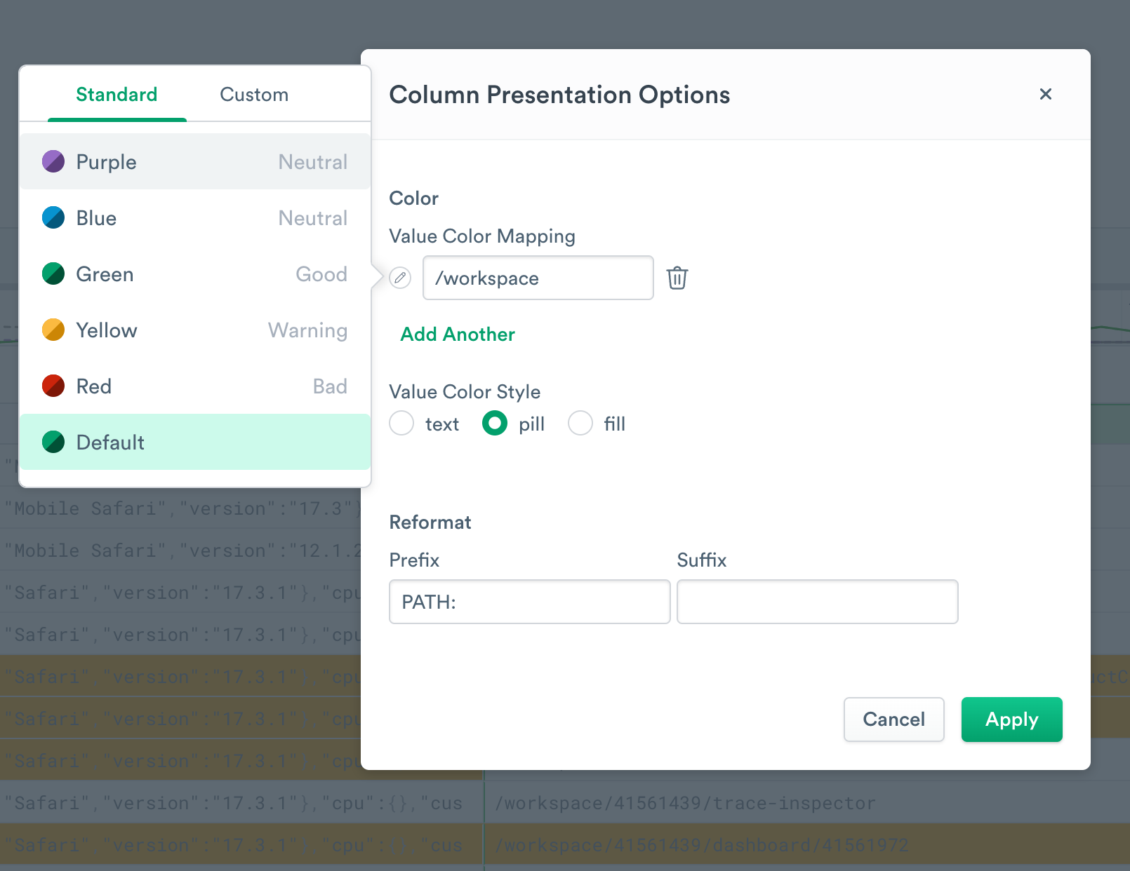
String data conditional formatting options
String data columns allow you to perform the following operations:
- Color - Select an exact match, then use the icon to the left to set a color for that match. Click Add another to apply more conditional color rules.
- Value Color Style - Change the presentation of colorized data.
- Reformat - Add a prefix and/or a suffix to all strings in the column. Note this is only a reformatting of the data visualization. To alter the actual data, see replace-regex.
Numeric data conditional formatting options
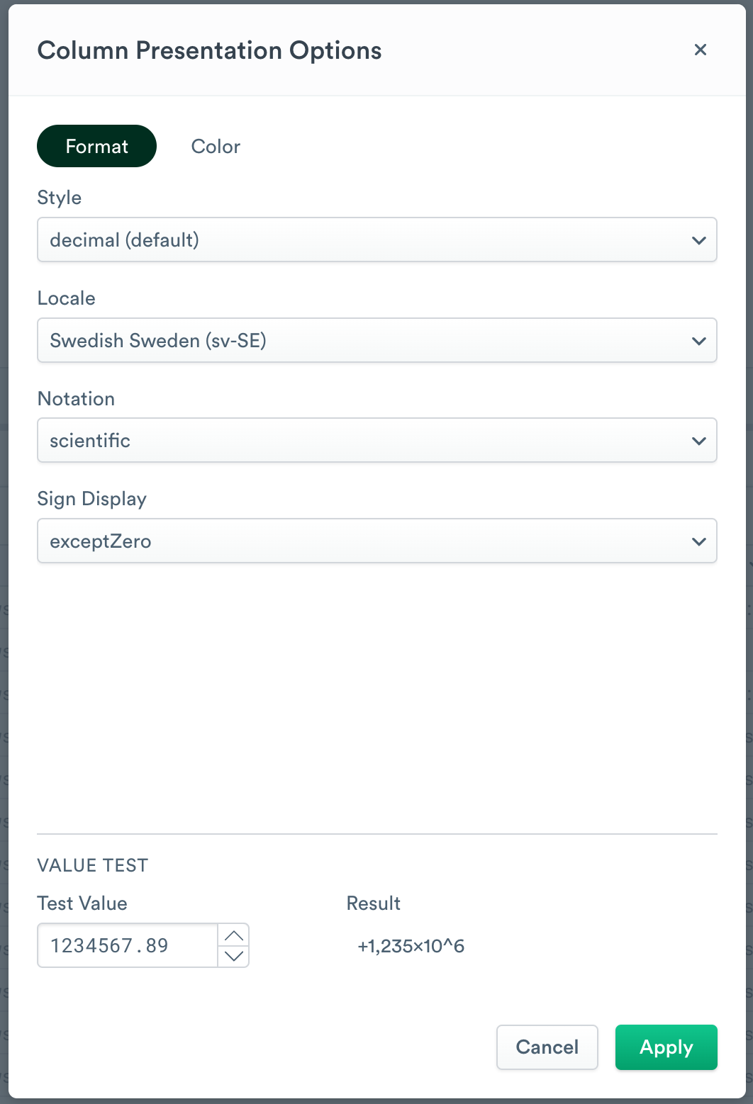
Numeric (int64 or float) columns allow you to change the formatting of the column or select a color scheme.
Customize the column formatting
The following options are available to customize the column formatting for numeric data:
- Decimal (the default) allows you to set the locale formatting for the column, select a notation style, and set a negative/positive sign display. For instance, if you need to work a physics problem such as the velocity and energy of a Swedish chef’s spoon flinging, you might set Locale to Swedish Sweden (sv-SE), Notation to scientific, and Sign Display to exceptZero.
- Currency is for displaying financial values. You can set the locale formatting, specify the currency name, and alter its display. Be sure to perform any necessary conversion math in OPAL, as this tool is only doing formatting.
- Unit formatting lets you select from pre-existing options such as weights, volumes, and data amounts, or enter a custom unit label. Custom units do not perform any math conversions on the data.
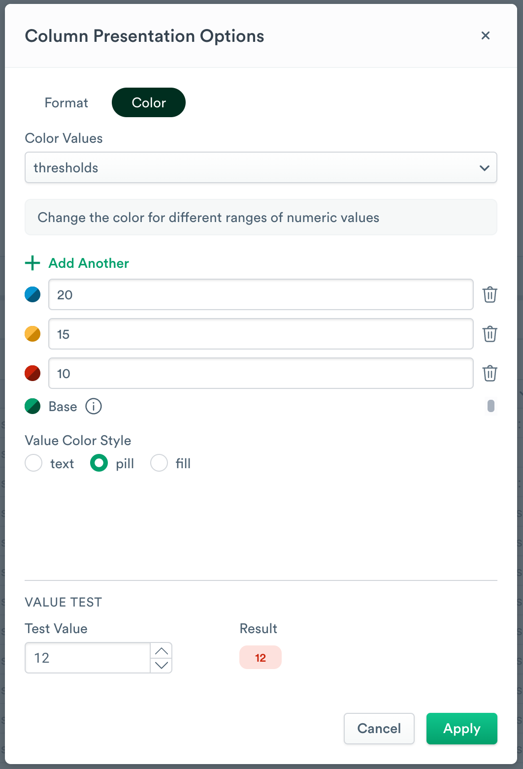
Customize the color
The following options are available to customize the color for numeric data:
- Use None to remove colorization.
- Range allows you to select a scale to apply automatically. Note that values outside the range will still be colorized as if they were at the extreme.
- Sequential ranges are useful for data that represents relative points on a scale. For example, you might want a Hot or Not visualization using Fahrenheit degrees. You could set your lower bound is 0 and your upper bound to 100 and your color scale to Inferno, which will cause lower temperatures to be purple and higher temperatures to be yellow. A temperature of 220 degrees will display with the same formatting as a temperature of 100 degrees.
- Diverging ranges are for data that represents opposing points, such as mutually exclusive choices. You can adjust the midpoint as well.
- Thresholds are used to establish color bands. This is especially useful for metrics. The base color is used for anything below the first threshold. Add more thresholds to set colors in the middle of the set. Values above the highest threshold will be given its color.
Updated 3 months ago