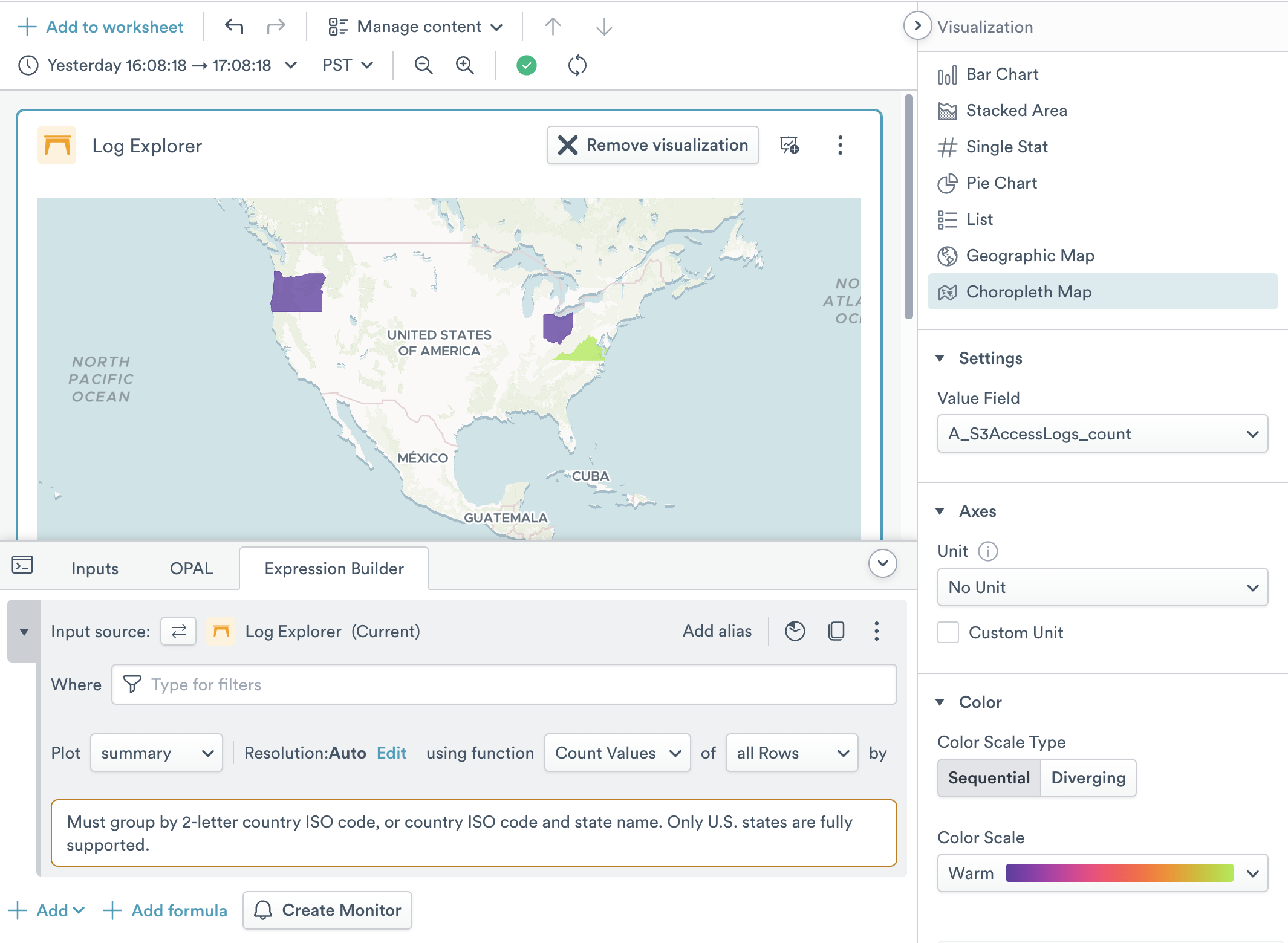
Choropleth map
The choropleth map visualization helps you visualize data on a map of the world using color fills on political regions. It requires that you have extracted Country and optionally Region values into a group using the Expression Builder. The country field should be a 2-letter country ISO code. You may optionally add a Region name, but only U.S. states are fully supported at this time. Note that spelling can differ from regional expectation and needs to match; use the MapTiler Geocoding control to test if strings can be located.
By default, only the top 100 groups or objects are visible in an Observe visualization, but many choropleths will have more groups than this. For instance, a world map of countries has 198 objects. To properly display this map, click Add Function, then TopK, then set the number of objects that will be included to 200.
The Settings area has a single option for setting the name of the integer field that is used to color the map.
The Axes section allows you to select the unit size that is displayed in the chart.
- Unit lets you set the base unit type of the variable. You can select from pre-existing options such as weights, volumes, and data amounts, or enter a custom unit label. Custom units do not perform any math conversions on the data. See Units of Measurement for more detail.
The Color area allows you to manage fill colors. Choropleths can have one of two types of color scales:
- Sequential is suitable for “less to more” sequences; for instance if you want to visualize the number of sales per U.S. State.
- Diverging is suitable for “this vs that” sequences; for instance if you want to compare successful transactions to errored transactions per U.S. State.