

Heatmap
A heatmap is a configurable visualization that displays an aggregated value as a color to represent a low to high gradient within a 2D grid.
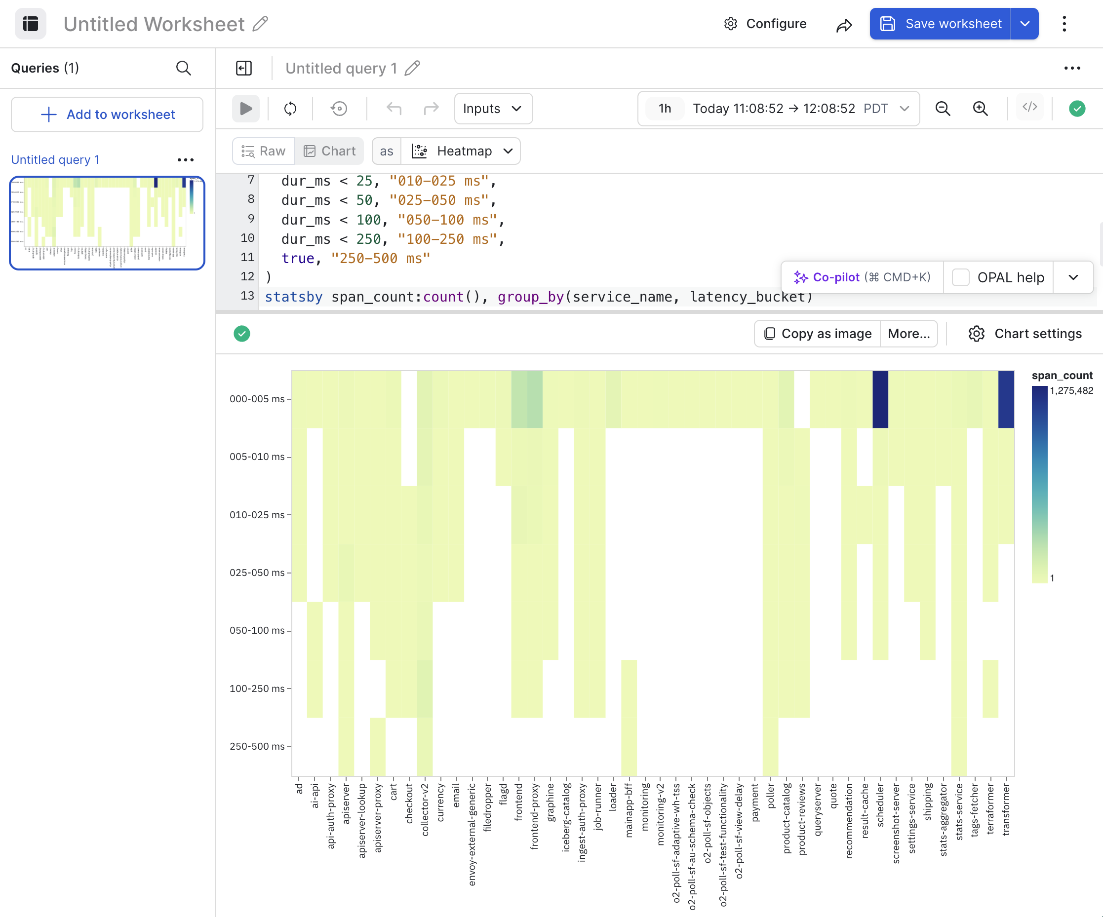
Heatmap settings
Click Chart settings to configure the properties for a heatmap.
| Setting | Description |
|---|---|
| Encoding | Configure how the data is mapped to the X and Y axes. |
| Colors | Configure the color theme you want to use for the visualization. Select Log scale or Reverse scale to further customize your desired color scheme. |
| Text | Select whether or not you want the values for each item printed in the visualization. |
| Number formatting | Configure how the values on the Y axis are represented.
|
Updated 2 months ago
Did this page help you?