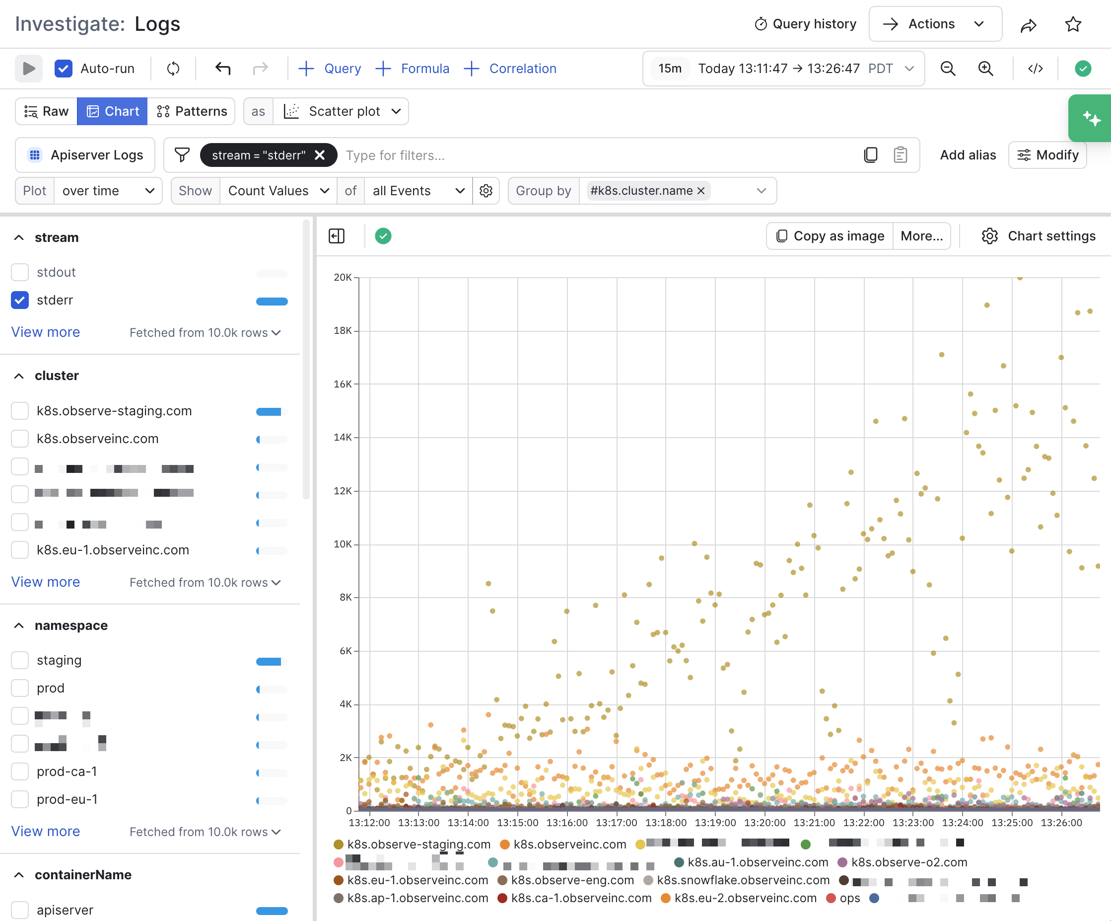
The scatter plot is a visualization type that plots values on a X-Y coordinates. It is helpful for visualizing the relationship between two variables, or to view outlier data.
Click Chart settings to configure the properties for scatter plot.
| Setting | Description |
|---|
| Encoding | Configure how the data is mapped to the X and Y axes.
Select Horizontal chart to change the visualization to a horizontal scatter plot. |
| Axis | Provides the following options:
- Show/hide the labels for the X and Y axes.
- Show/hide the X and Y axes grid lines.
- Select Fit to Data to have the scatter plot fill up the white space in the chart.
- Use Lower bound and Upper bound to lock the X and Y axes between exact minimum and maximum numbers.
|
| Y value formatting | Configure how the values on the Y axis are represented.
- Select a number unit type, such as decimal, unit, or currency.
- Select a locale, notation, compact display, and sign display
- Select Hide grouping separators to remove the commas, periods, or spaces used to break up large numbers into readable blocks.
- Select the number of fraction digits and significant digits you want displayed.
|
| Point style | Select how you want the dots in the chart to be stylized:
- Select translucent, solid fill, or no fill dots.
- For single-series scatter plots, select the data you want each dot to represent and how you want the dots repsented by size.
|
| Legend and tooltip | Customize the legend in the chart:
- Select whether you want to have a visible legend, its position, and whether to display as a list or table.
- Select the sort order of the legend, either ascending or descending.
- Customize how you want null entries displayed.
|
| Colors | Configure custom colors you want to use for each item in the chart. |
| Overlays | Configure additional visual markers on the chart:
- Enable Show Thresholds to show a line delineating some threshold number, perhaps corresponding with a threshold in a Monitor that when exceeded, will fire an alert.
- Use Annotation Label and Dataset together to view the data from another Dataset on top of your visualization, such as viewing deployment markers for APM.
|