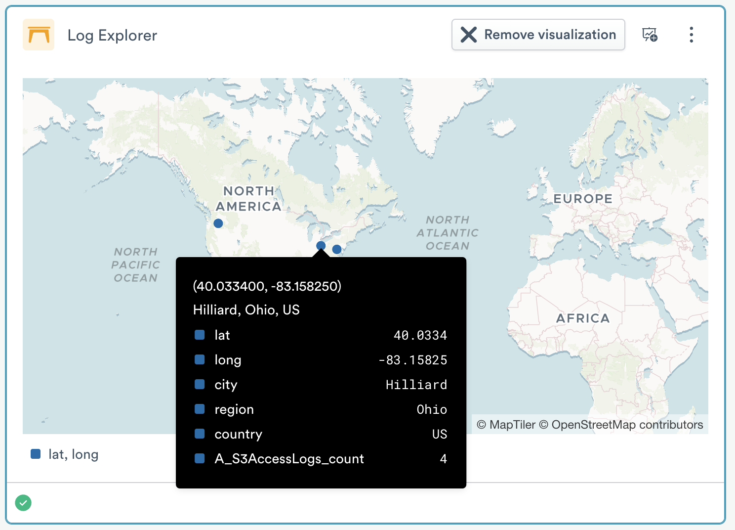
Geographic map
The geographic map visualization helps you visualize data on a map of the world. It requires that you have extracted latitude and longitude values, and can optionally use Country, Region, and City values in enriched tool tips on location dots representing the data.
The Settings area has two options for setting the required fields that are used to position dots on the map.
- Latitude field is where you set the latitude
- Longitude field is where you set the longitude
The Geographic Map area has four options for handling non-required fields.
- The Country field is used in the tool tip display for a rendered location dot.
- The Region field is used in the tool tip display for a rendered location dot. Region is a normalized standard name for areas that may have different and more familiar names, such as State, Province, Territory, or District.
- The City field is used in the tool tip display for a rendered location dot.
- The Tool tip field is used to edit the content of the enrichment tool tip. The default is to show all fields in the data set; use this field to reduce the set. Note that these fields are not used to place dots, only to enrich them.
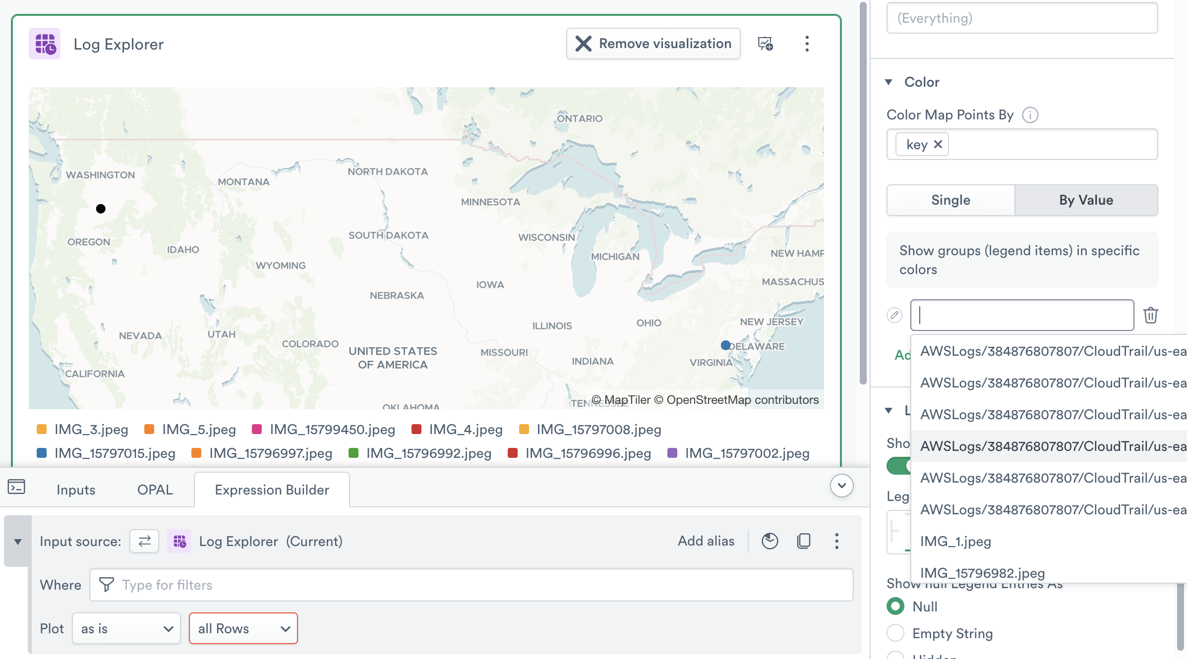
The Color area allows you to manage dot colors. If you want a single color, use the Single option and select a color from the palette. To set colors by the values in a field, use the By Value option and name each value, then click the pencil to the left to set its color. If no changes are made in this area, Observe will randomly select colors.
Geographic Map charts have a legend which names the value being charted and shows its matching color. The Legend area lets you change the position of this legend to any of the four edges of the visualization. You can also change how null legend entries are displayed, which can be useful in sparse datasets.