Hex grid
A hex grid is a way to visualize data grouped into sections (hexagons) with the option of adding a color and label to each hexagon. It can be a helpful way to get a quick overview of a variety of objects, such as Nodes or Servers.
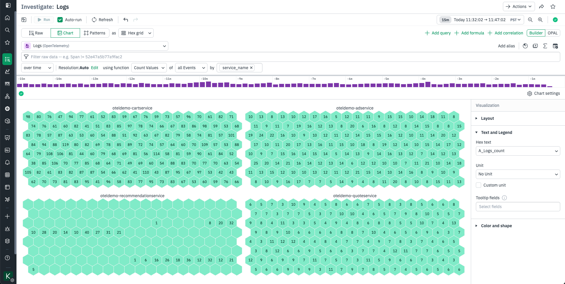
The hex grid visualization is for logically grouping and annotating data. This visualization arranges your data into groups of uniformly sized hexagonal grids, like cells in a honeycomb. Each hexagon can be labeled and colored by data-driven rules.
Use the Layout option to choose a grouping Cohort. Hexes will be grouped together by this column’s value.
Use the Text and Legend area to select the column that will be used to label and color your hexes. Hex grids can all be one color, set by threshold or value, or set to follow one of two types of dynamic color scales:
- Threshold lets you set colors for numeric values at or over a threshold. To set colors by the values in a field, use the Threshold option and select a Field, then set the threshold values. Thresholds are sequentially ordered.
- If you have multiple values in a column, use the Value option and select the values to color hexes by. Click the pencil to the left to set its color.
- The Range option is where you select dynamic ranges. Select a numeric Field to apply range scaling with, then select a Color Scale Type. Sequential is suitable for “less to more” sequences; for instance if you want to visualize the number of sales per U.S. State. Diverging is suitable for “this vs that” sequences; for instance if you want to compare successful transactions to errored transactions per U.S. State. You can also adjust range bounds and midpoints here.