

Bar chart
The bar chart is a familiar visualization that presents a value in either vertical or horizontal bars. Bar charts are useful for comparing quantities across different categories.
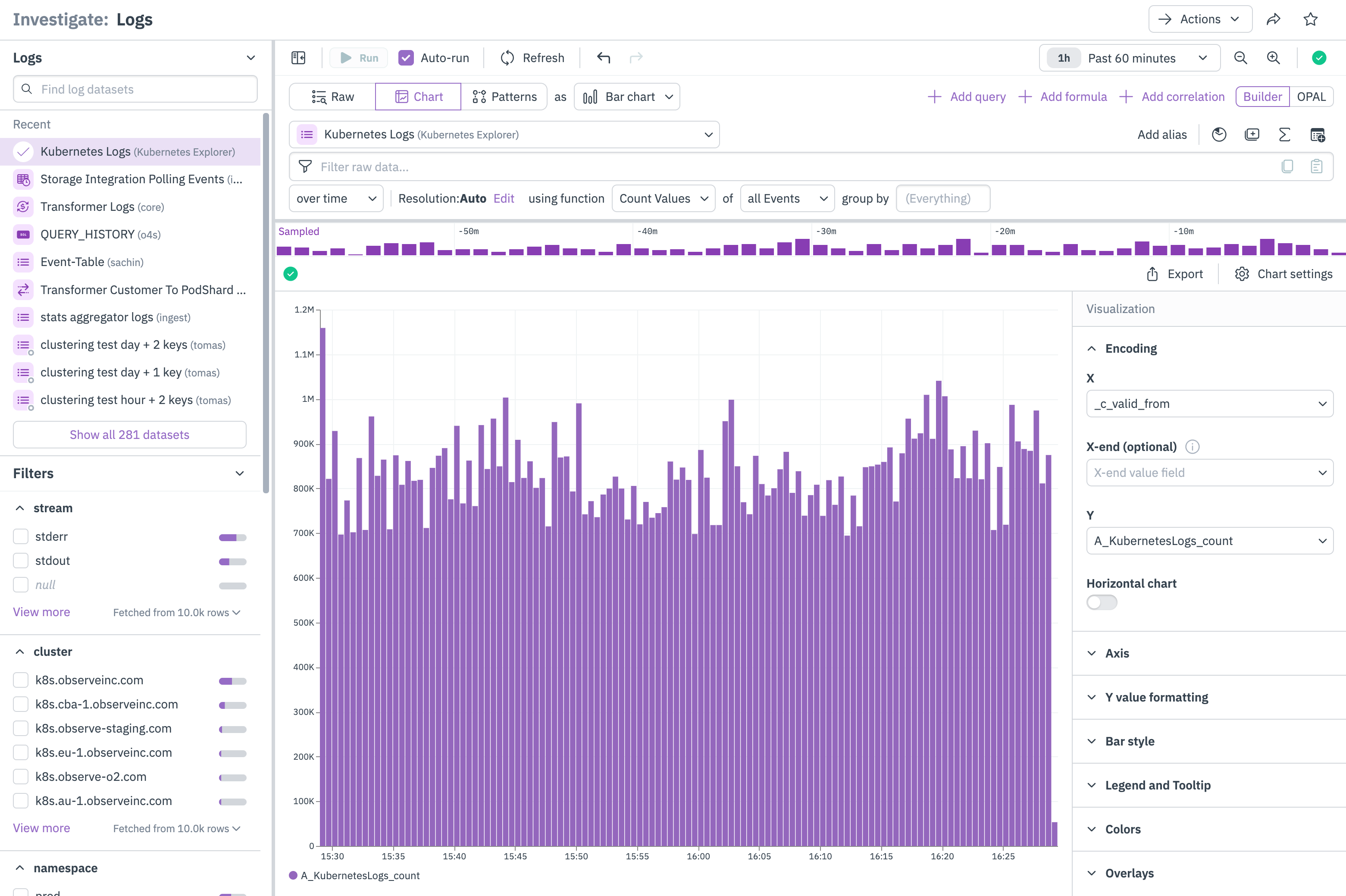
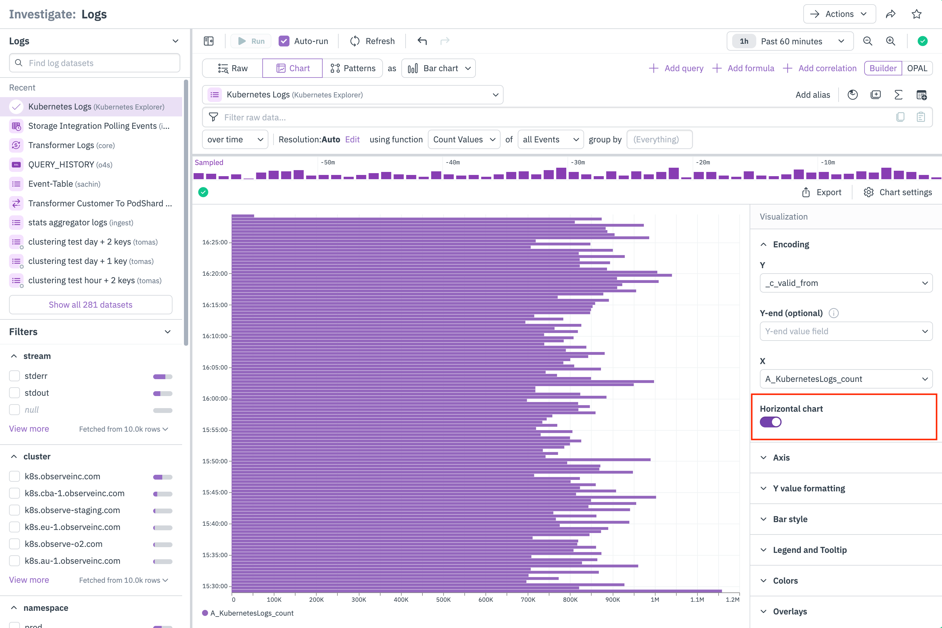
Bar charts can additionally be displayed as grouped bar charts, or horizontally, as shown below, by selecting Horizontal chart in the Encoding settings. See Bar chart settings.
For example, you can use vertical bar charts to compare data over time, while horizontal bar charts are useful for comparing fixed and discrete categories, such as countries, products, or names.
Bar chart settings
Click Chart settings to configure the properties for a bar chart.
| Setting | Description |
|---|---|
| Encoding | Configure how the data is mapped to the X and Y axes. Select Horizontal chart to change the visualization to a horizontal bar chart. |
| Axis | Provides the following options:
|
| Y value formatting | Configure how the values on the Y axis are represented.
|
| Bar style | Select how you want the bars to be stylized:
|
| Legend and tooltip | Customize the legend in the chart:
|
| Colors | Configure the color scheme you want to use for the chart. |
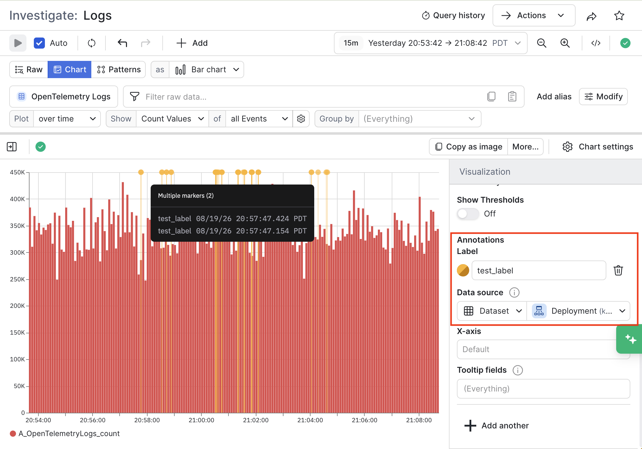
| Overlays | Configure additional visual markers on the chart:
|
Below is an example of a Deployment Dataset on top of some Kubernetes log data:
Updated 2 months ago
Did this page help you?