Metrics Explorer
Metrics contain any value you can measure over time, such as blocks used on a filesystem, the number of nodes in a cluster, or a temperature reading. Observe reports Metrics in the form of a time series, which are a set of values in time order. Each point in a time series represents a measurement from a single resource, with its name, value, and tags.
For more information about Metrics, see Collect and use metrics.
Metrics Explorer overview
Before you begin looking at metrics, take a few minutes to understand the various capabilities of Metric Explorer.
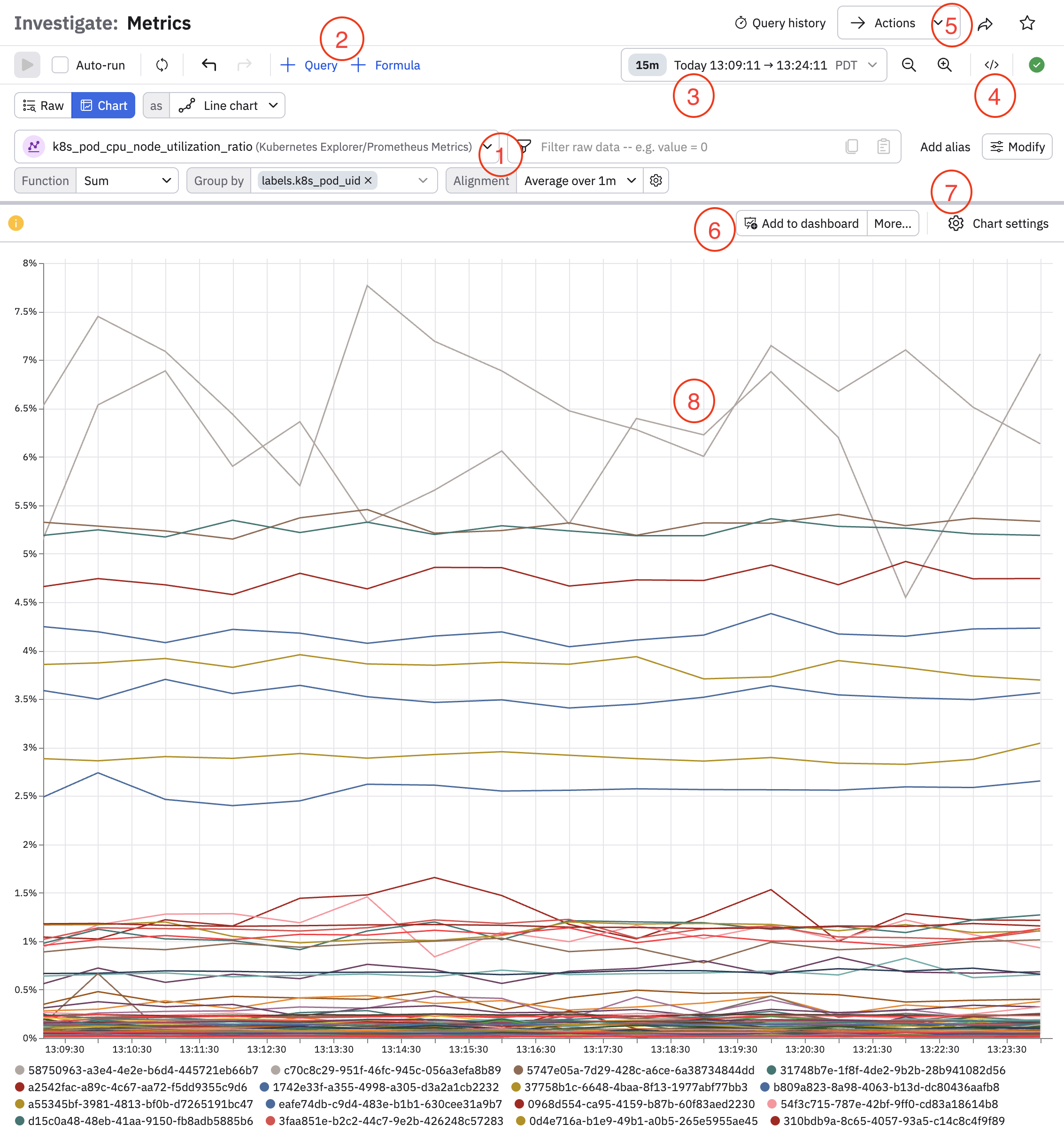
| Feature | Description |
|---|---|
| (1) Query bar | Click the drop-down list to find and select the metric you want to view. For example, type cpu into the field to see all Metrics Datasets with cpu in the name. Click in the filter panel to perform additional filtering by selecting tags and fields. Use the Function, Group by, and Alignment options to further shape the data you want to see. |
| (2) Query settings | Click + Query to add additional queries with AND or OR conditions. Click + Formula to make mathematical calculations using your queries. You can also click Raw to view the raw data in a table, or change the visualization type in the as drop-down list. |
| (3) Time picker | Click in the drop-down list with the time window to change the time window for viewing the metrics. You can do any of the following:
|
| (4) View OPAL | Click the code icon () to view your query in OPAL. |
| (5) Actions | Once you have your Metrics Dataset, you can select from the following Actions:
|
| (6) Add to dashboard | Click Add to dashboard from any visualization to a dashboard that you reference "at-a-glance" for details on activities. If you are viewing raw data in a table, instead of seeing Add to dashboard here, you will see options to download the data as a CSV or JSON file. |
| (7) Chart settings | Configure settings for the chart, such as encoding, X- and Y-axis settings, labels, colors, and overlays. |
| (8) Visualization or table | The elements of any visualization type or table are active and provide further pivots. For example, you can click on any line in a line chart and pivot to logs, metrics, and traces. |
Use Metrics Explorer to analyze metrics
Immediately visualize any Metrics Dataset using Metrics Explorer. From the left Navigation bar, click Metrics to view Metrics Explorer.
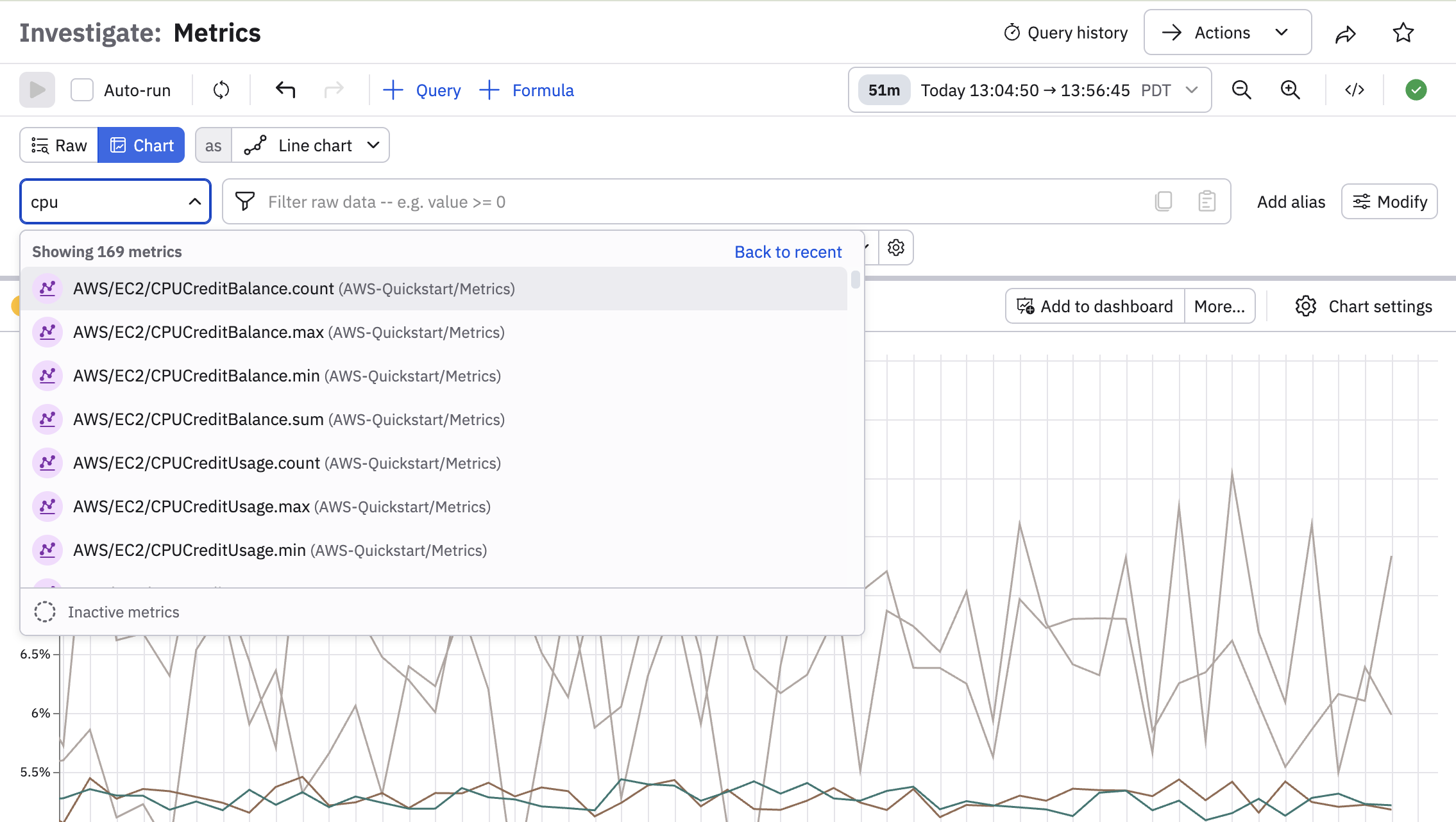
To locate a specific Metrics Dataset, you can search for it by by entering the name or partial name to locate it. For instance, type cpu into the field to see all Metrics Datasets with cpu in the name.
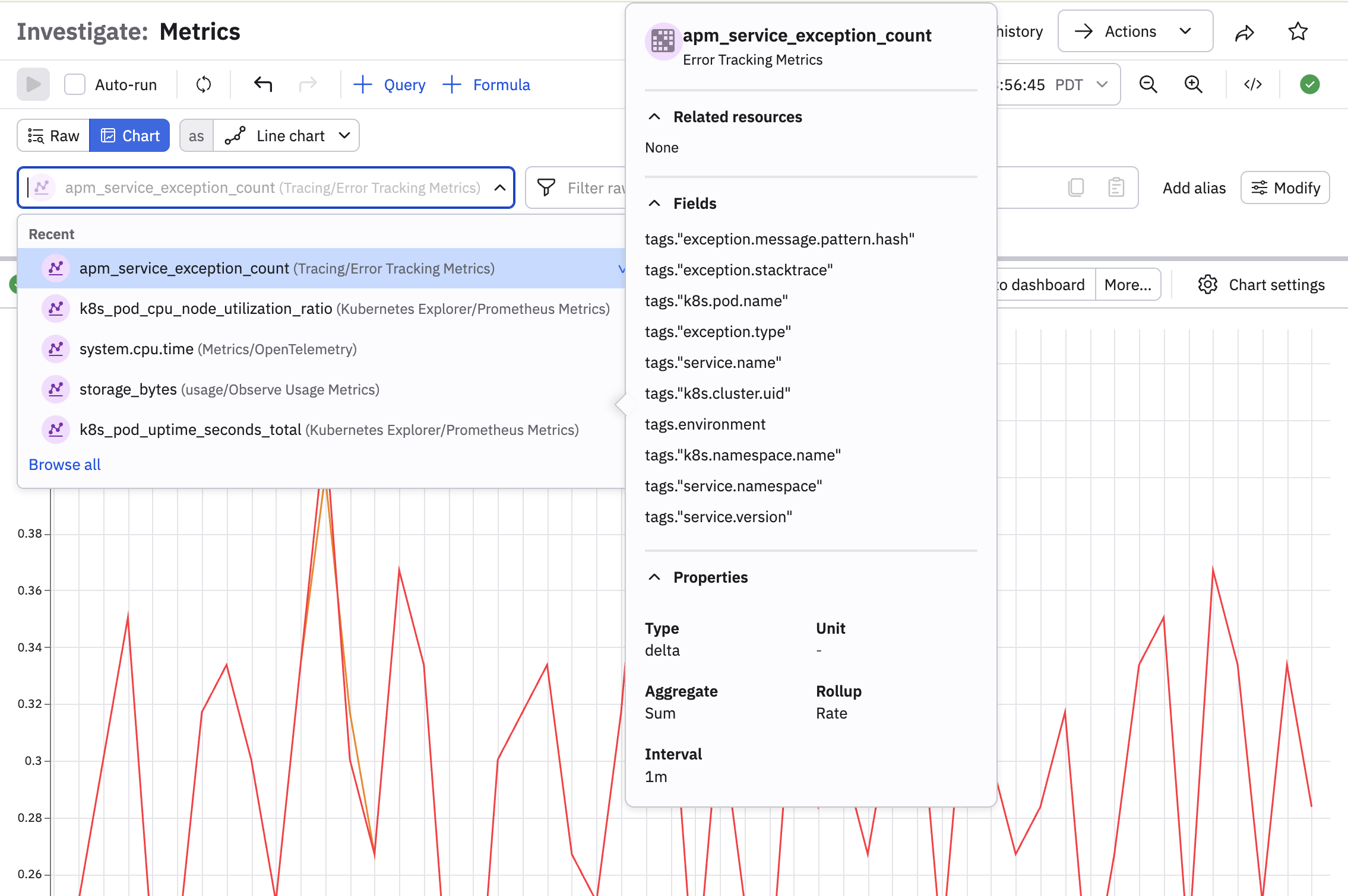
Hover on any Metrics Dataset to view additional information about the content of the Dataset, such as related resources, fields included in the Dataset, and Dataset properties:
Configure a query using query builder
After selecting a metric, use the other part of the query builder to filter specific information. For example, this query shows the average node CPU utilization over the last minute, grouped by pod ID:
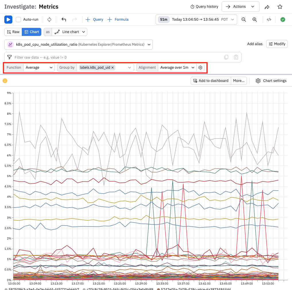
Hover over any vertical slice of the time series visualization to identify the pods and their average CPU usage at that point in time. For example:
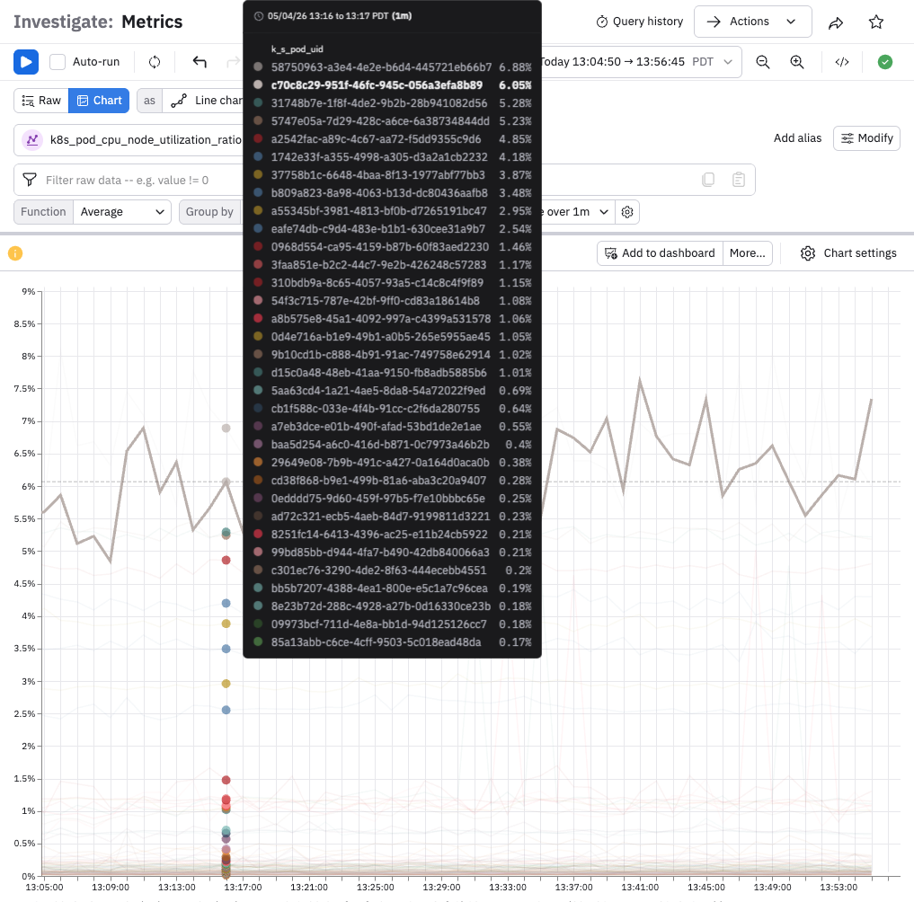
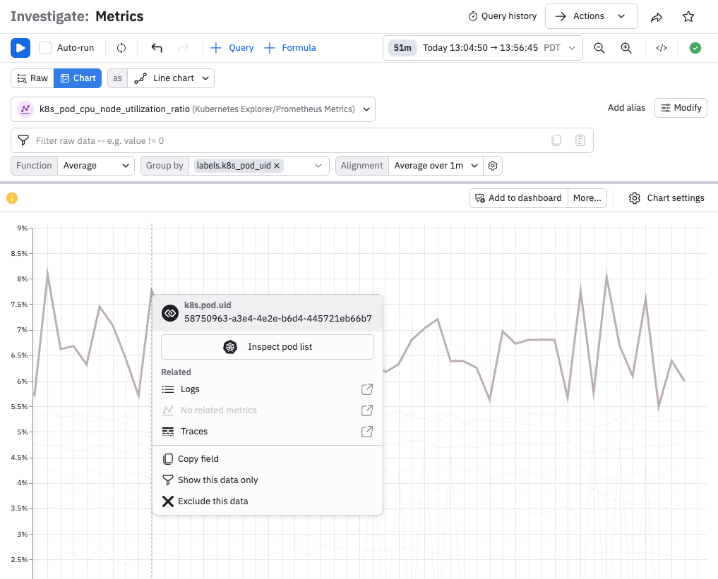
Each node is represented by a unique colored dot. Click on any dot to view the options available for further investigation:
You can select from the following options:
- Show this data only - this allows you to display only that graph line in the visualization.
- Exclude this data - remove the data from the visualization.
- Copy - copy the graph line.
- Inspect - inspect the data for the graph line.
- For selected resource - displays the related resource which you can open in a new window.
- Related - view related logs, metrics, and traces in a new window.
Double-click the graph line to return to the full visualization. To further investigate the cause of the high CPU Utilization, click Actions, and then Worksheet. Creating a Worksheet allows you to view the Metrics Dataset and perform modeling of the dataset.
Once you have the visualization with the desired Metrics information, perform one of the following Actions:
- Create monitor - create a monitor to alert you about high CPU Utilization.
- Add to dashboard - add the visualization to a Dashboard that you reference "at-a-glance" for details on CPU Utilization.
- Open in worksheet - perform further modeling of the Metrics Dataset.
In Query Builder, you can select from the following types of visualization:
- Time Series
- Bar Chart
- Stacked Area
- Single Stat
- Pie Chart
- Value Over Time
Customize your Visualization even more by changing these parameters:
- Settings - customize the X and Y Axis using the dropdown menus to change the display.
- Axes - select units and customize the X and Y axis labels.
- Color - changes the colors used in the Visualization.
- Chart Style - change the shape of the graphed line.
- Legend - change the legend position and presentation.
- Thresholds - toggle displaying thresholds on and off.
The visualization Alignment defaults to Over Time using Average (look back 10s). To change the Alignment type, click Edit. Select from the following to model your Metrics Dataset:
- Sum - the default value for the OPAL function is Sum.
You can select from the following list of available OPAL functions:
- Any - Return any value of one column across a group.
- Any not null - Return any non-null value of one column across a group. Can still return null if all values in the group are null
- Average - Calculate the arithmetic average of the input expression across the group.
- Count Values - Count the number of non-null items in the group.
- Count Distinct Fast - Estimate the approximate number of distinct values in the input using
hyper-log-log. - Count Distinct Exact - Count the exact number of distinct values in the input using complete enumeration.
- Maximum - Compute the maximum of one column across a group (with one argument) or the scalar greatest value of its arguments (with more than one argument).
- Median - Return the fast approximate median value of one column.
- Median Exact - Return the exact median value of one column.
- Minimum - Compute the minimum of one column across a group with one argument or the scalar least value of its arguments with more than one argument.
- Percentile(99) - Returns an approximated value for the specified percentile of the input expression across the group.
percentile(@."*metric*", .99 - Percentile(95) - Returns an approximated value for the specified percentile of the input expression across the group.
percentile(@."*metric*", .95 - Percentile(90) - Returns an approximated value for the specified percentile of the input expression across the group. percentile(@."metric", .90`
- Percentile(75) - Returns an approximated value for the specified percentile of the input expression across the group. percentile(@."metric", .75`
- Percentile(50) - Returns an approximated value for the specified percentile of the input expression across the group. percentile(@."metric", .50`
- Prometheus Quantile(99) - Returns a value for 99th percentile distribution.
- Prometheus Quantile(95) - Returns a value for 95th percentile distribution.
- Prometheus Quantile(90) - Returns a value for 90th percentile distribution.
- Prometheus Quantile(75) - Returns a value for 75th percentile distribution.
- Prometheus Quantile(50) - Returns a value for 50th percentile distribution.
- Standard Deviation - Calculate the standard deviation across the group.
- Sum - Calculate the sum of the argument across the group or the scalar arguments if more than one.
- Don't Aggregate - Do not aggregate metrics.
You can also build a query using the OPAL console and OPAL language.
To monitor these metrics and create an alert about increased CPU Utilization, see Create a threshold monitor .
Live mode
NoteOnly customers with usage-based pricing can access this feature.
When viewing Metrics, you can select one of the Live Mode options from the Time-Range picker and see your Metrics stream into Observe. Filter your Metrics and generate visualizations that continuously update with new data. As soon as you click Live Mode, ingest and transform pipelines run at the highest possible rate. As new data arrives, the data transforms, and the query reruns.
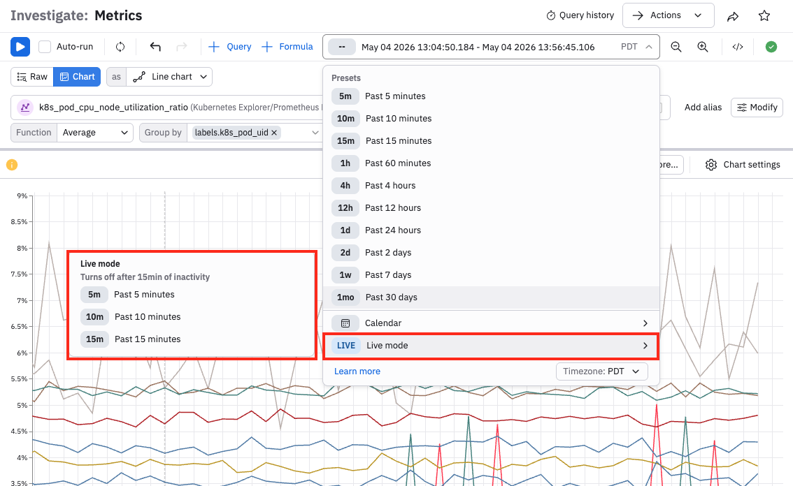
NoteUse Live Mode to start a one-time materialization of your data as Live Mode functions as a temporary freshness boost.
Since Live Mode increases your credit usage, you may want to disable it unless actively working on troubleshooting an ongoing issue. Live Mode automatically becomes disabled after 15 minutes. Using the Time Scrubber feature also automatically disables Live Mode.
For Metrics Explorer, you can select from 5 minutes, 10 minutes, or 15 minutes.
When you enable Live Mode, and click the two circles icon next to the Time-Range picker, you see information about the query similar to the following image.
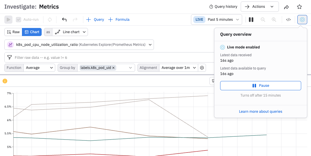
Latest data received - the time that data required for the query most recently arrived on the Observe instance but has not yet been processed.
Latest data available to query - the latest system time at which new data was processed and became available for Observe to query it. Live Mode users can typically expect between 30 and 90 seconds of latency from source to screen, depending on data rate and agent configuration.
These two status messages may have slightly different times as the first one designates the time that the data required for the query most recently arrived on the Observe instance but has not yet been processed. The second message designates the time the data became available for Observe to query it.
Export data
To download the data displayed in Metrics Explorer, click the Actions menu in the top right and Open in Worksheet. On a Worksheet you can switch the visualization to Table, and then click the Export button. You may select CSV or JSON format, and a maximum size limit (one thousand, ten thousand, or one hundred thousand rows). Note that hidden fields will be included. Use the pick_col OPAL verb to reduce the width of downloaded data.
Updated 3 months ago