Waterfall chart
Waterfall charts are useful for analyzing span and trace data, and seeing how individual operations contribute to overall latency, where delays occur, and how different services or components interact over time. Waterfall charts work best with Datasets that have a parent/child relationship in the data, such as the Tracing/Span or OpenTelemetry/Span Datasets.
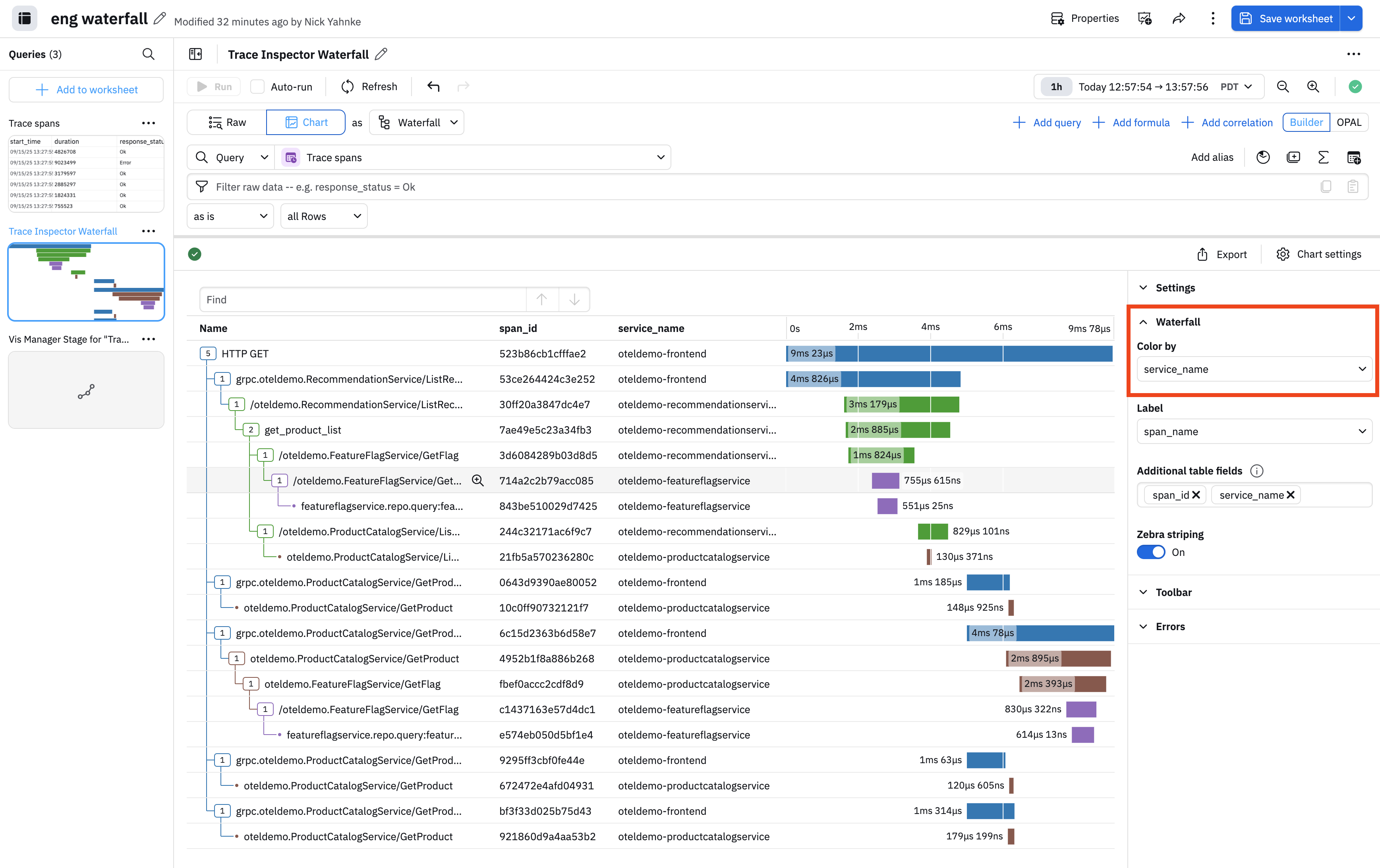
You can customize your waterfall charts by color coding specific fields. In this example, we color code by service name so that each service name has its own unique color:
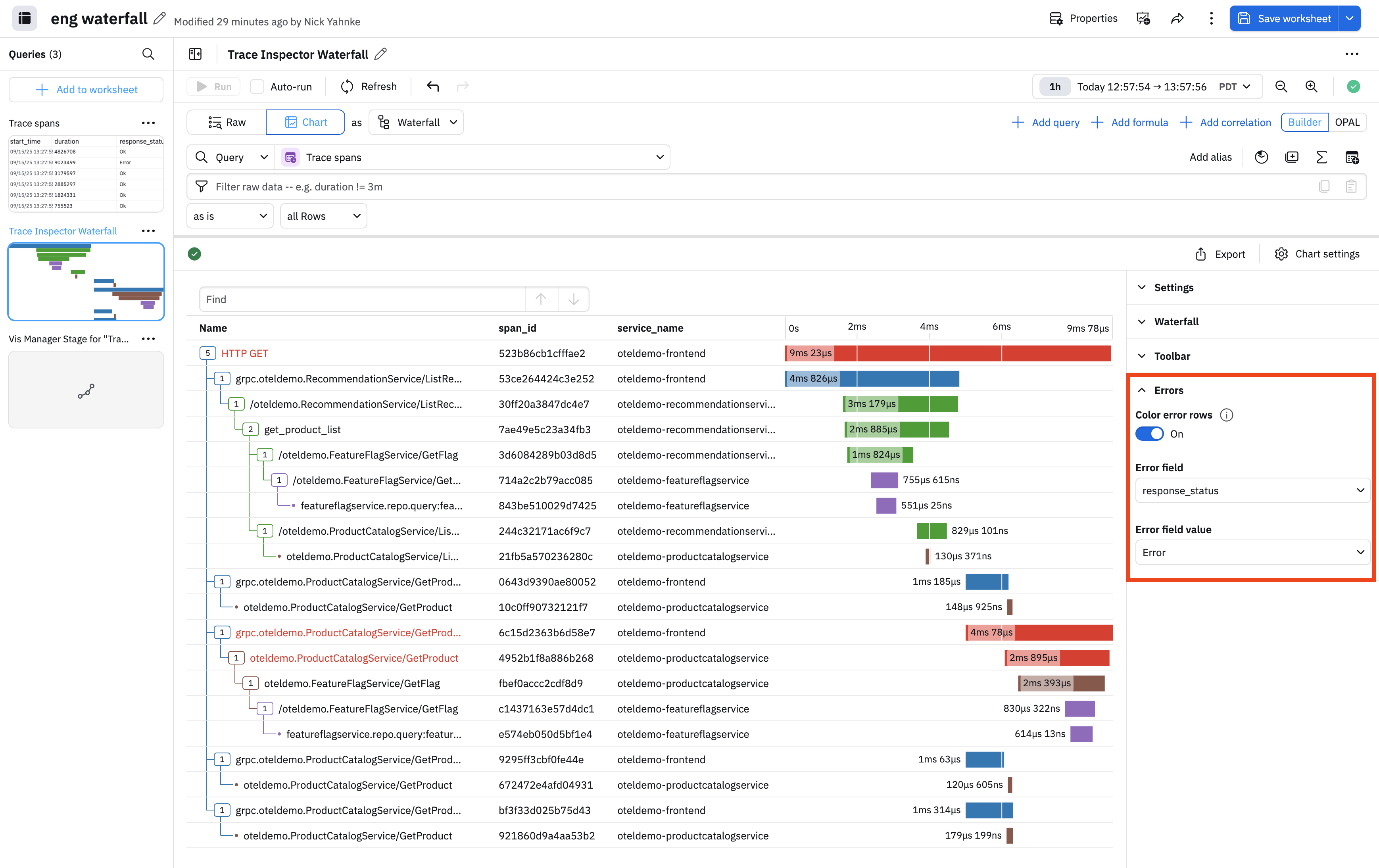
We can further customize by highlighting errors. In the Error settings, slide the Color error rows toggle to the on position. In this example, we are highlighting any time a response_code contains an error, shown in red:
You can also customize the visualization by changing the table columns under Settings, and hiding the search field under Toolbar.