Pie chart
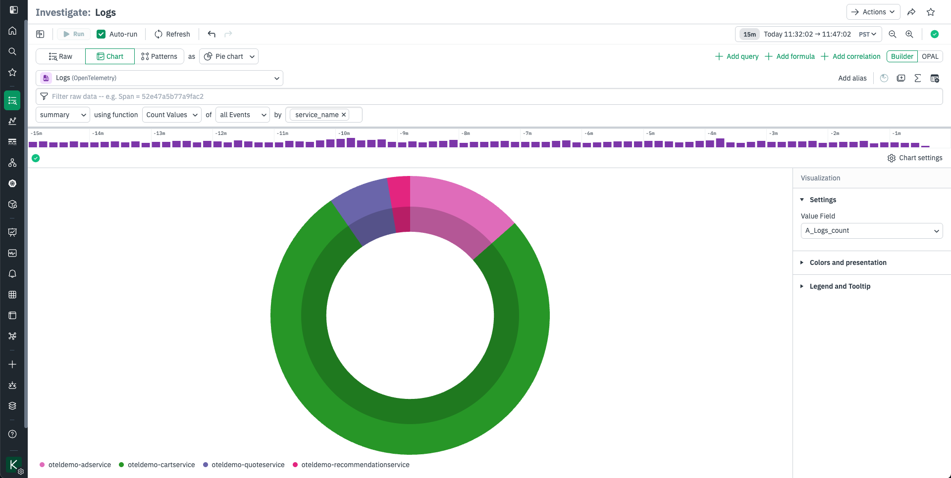
A pie chart is a familiar visualization which represents the relative size of values as slices of a circular graph. The pie chart visualization is ideal for visualizing Datasets that naturally produce a complete whole, such as the number of tasks executed in a time period by a continuously running task engine. Note that Observe’s pie chart defaults to rendering as a ring with a shaded center, this a style decision that reduces human estimation errors.
The Settings area has a single option, for setting the field that will be displayed.