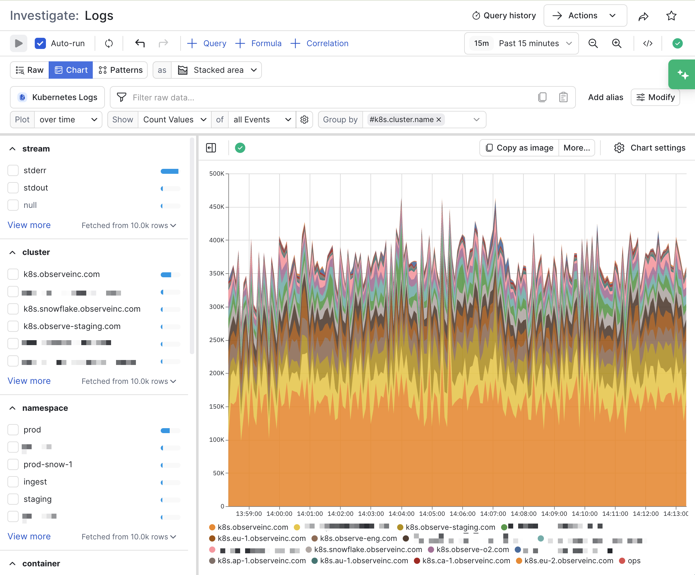
The stacked area chart is like a line chart, but values are ordered and stacked with smaller values on the top. This is useful for comparing related values in context while preventing some values from being hidden by overlapping.
Click Chart settings to configure the properties for a stacked area chart.
| Setting | Description |
|---|
| Encoding | Configure how the data is mapped to the X and Y axes.
Select Horizontal chart to change the visualization to a horizontal line chart. |
| Axis | Provides the following options:
- Show/hide the labels for the X and Y axes.
- Show/hide the X and Y axes grid lines.
- Select Fit to Data to have the line chart fill up the white space in the chart.
- Use Lower bound and Upper bound to lock the X and Y axes between exact minimum and maximum numbers.
|
| Y value formatting | Configure how the values on the Y axis are represented.
- Select a number unit type, such as decimal, unit, or currency.
- Select a locale, notation, compact display, and sign display
- Select Hide grouping separators to remove the commas, periods, or spaces used to break up large numbers into readable blocks.
- Select the number of fraction digits and significant digits you want displayed.
|
| Area style | Select how you want the lines to be stylized:
- Select Show points to render points on the lines for all areas.
- Select Show values to print the values. This is only available for single-area charts.
- Select linear, curve, or step line style.
- Select Normalize to draw all areas as a percentage of the total, rather than absolute values.
|
| Legend and tooltip | Customize the legend in the chart:
- Select whether you want to have a visible legend, its position, and whether to display as a list or table.
- Select the sort order of the legend, either ascending or descending.
- Customize how you want null entries displayed.
|
| Colors | Configure the color scheme you want to use for the chart. You can customize the colors used for each area. |
| Overlays | Configure additional visual markers on the chart:
- Enable Show Thresholds to show a line delineating some threshold number, perhaps corresponding with a threshold in a Monitor that when exceeded, will fire an alert.
- Use Annotation Label and Dataset together to view the data from another Dataset on top of your visualization, such as viewing deployment markers for APM.
|