Edit dashboards to visualize data
Dashboards are a convenient way to visualize important data in one place. Observe provides a quick and easy method of creating dashboards from your Datasets.
Filter data in a dashboard
The filtering options that are available when using a dashboard are set when the dashboard is created or edited. Contact the dashboard owner if you are unable to filter a dashboard as expected.
The following types of filters are available for dashboards:
- FIlter bar
- Filter panel
- Dashboard parameters
A dashboard may include any number of these options depending on the selections made by the dashboard creator.
Filter panel
The filter panel uses a single Dataset to populate the panel in the left rail of a dashboard.
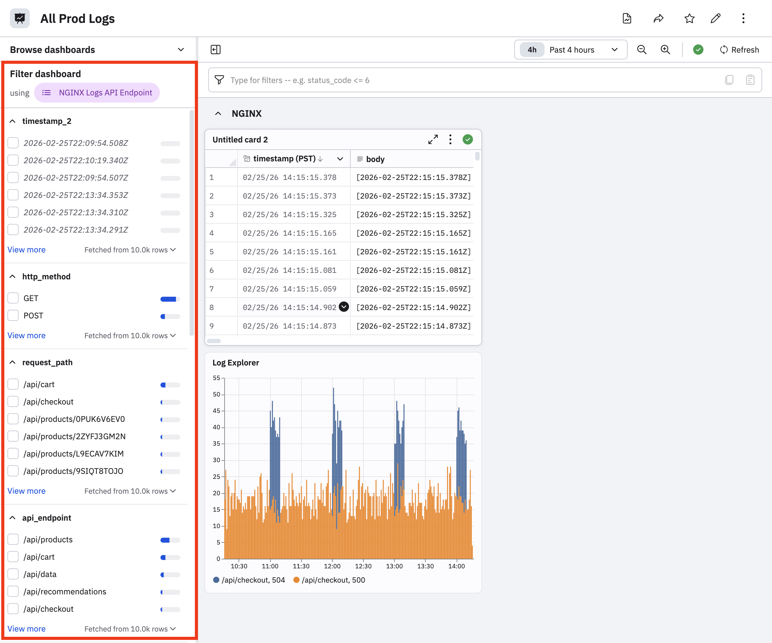
The columns of that Dataset are used to generate filters that can apply to the dashboard cards that use the filtering Dataset. For example, a dashboard displaying container logs can use a filter panel to automatically filter by container log relevant columns such as Cluster, Image, Namespace, and Reason. A card on that dashboard which does not source container logs, such as Git Commit History, will not be affected by the filter panel.
When you select a filter in the dashboard panel, it automatically appears in the filter bar:
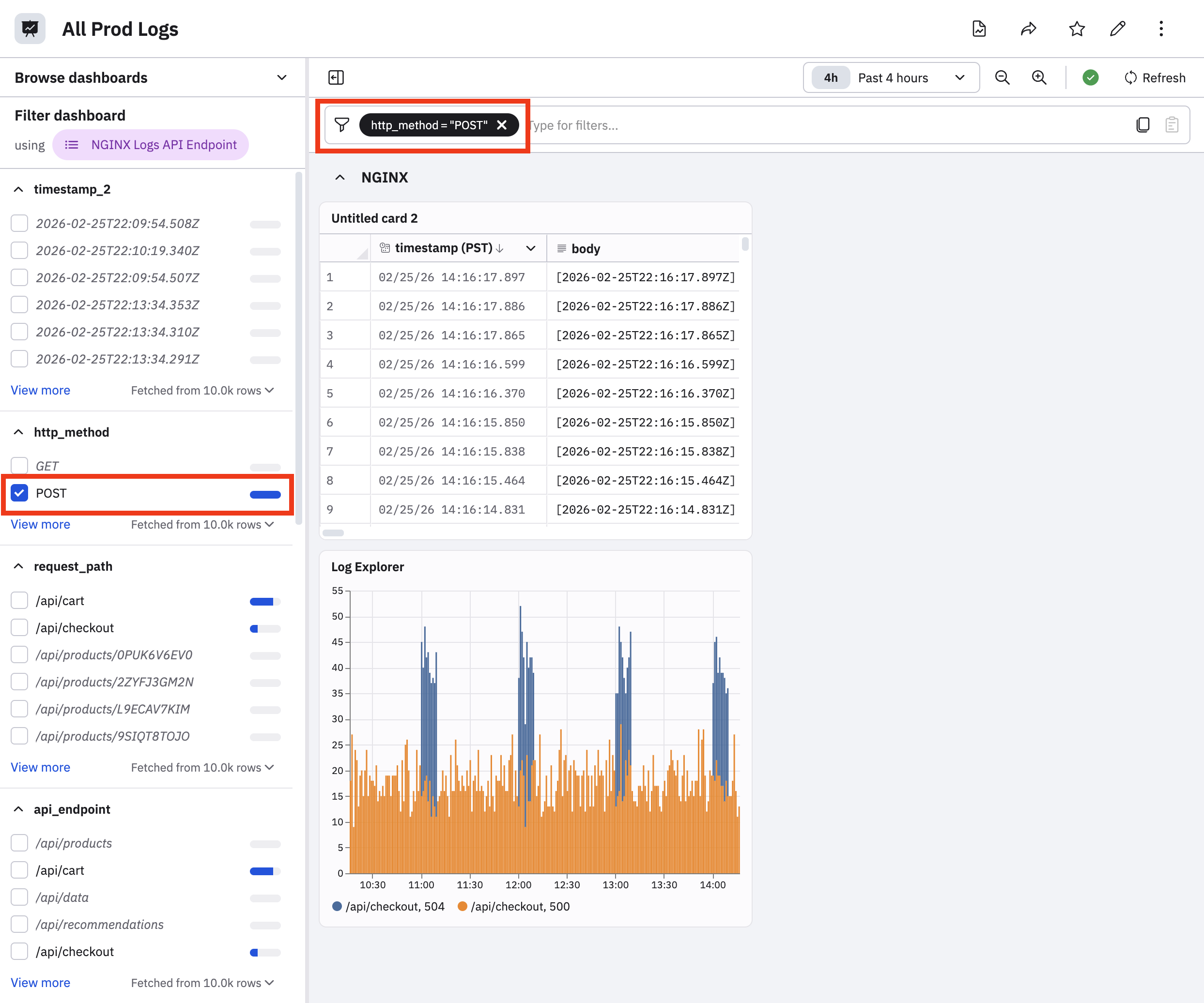
Filter bar
Use the filter bar to apply operations based on the Dataset used in the filter panel. You can use ~ or !~ for keyword matching. For example, on our Container Logs dashboard the filter bar can be used to quickly type reason ~ create to filter by container logs with a reason code like ContainerCreating or CreateContainerConfigError.
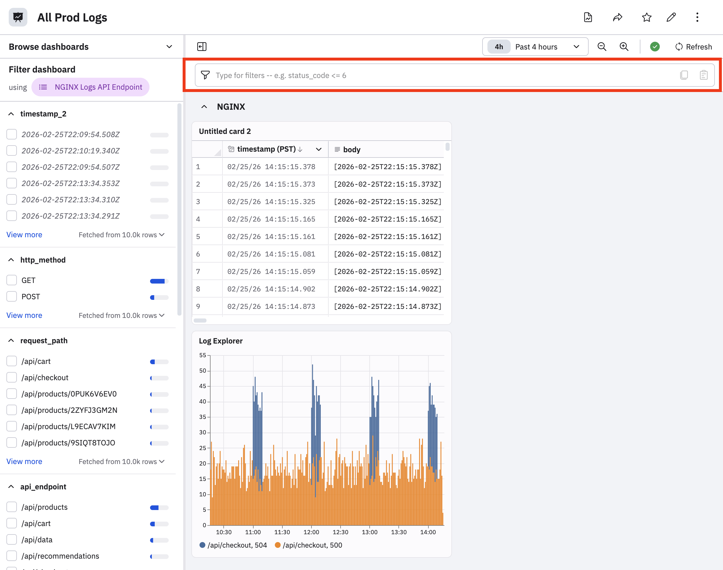
To populate the filter bar, you can do any of the following:
- Select something in the filter panel to have that value appear in the filter bar.
- Click in the filter bar, then select the fields and values you desire with the help that appears.
- Type your query directly into the filter bar.
Dashboard parameters
A dashboard may also have parameters: dropdown or text entry fields that allow you to narrow a dashboard's results. For instance, our Container Logs dashboard might have a text entry field where you can paste an image hash, or a dropdown where you could select an instance name. See Add dashboard parameters.
Presentation mode
A dashboard or series of dashboards can be configured to present in a slideshow, suitable for use in a shared-screen environment such as a NOC (Network Operations Center) or SOC (Security Operations Center). To configure a presentation, open the dashboard and click Presentation View from the context menu at top right. The dashboard will open in presentation mode on a new tab.
While in presentation mode, a dashboard's parameters are still visible, but cannot be changed. The filter bar and filter panel are not visible. Dashboards that are larger than the screen display area will slowly scroll down and up to ensure that all data is visible over time. Moving the mouse will cause a Stop button to appear in the middle of the dashboard. Click this button to stop the display, or to configure more advanced behavior.
The presentation mode configuration screen lets you change how often the dashboard refreshes its data from the default of five minutes. You can also add more dashboards, and chose an animation effect for switching between dashboards in a slideshow. The amount of time each dashboard is on screen can also be changed from the default of one minute. Click the Start Slideshow button to return to presentation mode.